
Did you know that almost half of the users on the Internet (48%) consider web design as the number one factor in determining the credibility of a business?
As someone who’s been in the game for almost a decade, I’ve seen the web design landscape change and evolve in ways I never thought possible. From the early days of HTML and CSS to the rise of responsive design, from skeuomorphic design to flat design, it’s been a wild ride. But with time, we’ve all come across and have been introduced to modal web design, and it has been heavily compared to the likes of a pop-up or dialogue box. Some say it’s the future of user experience, while others dismiss it as just another passing fad.
So what’s the deal?
I decided to do some digging and find out for myself. And let me tell you, what I discovered might just surprise you. I’m excited to take you on a journey into the world of modal web design and share my insights on its potential impact. Not just that, I also have my experiences to share apart from what I find relevant in today’s time.
But, just like any journey, we need to start from the start, i.e., let’s first understand what modal is (it’s for those who are new to this concept and want a brief explanation). Before that, I have some extra information to share. To view it, click the “Click Here” button below.
Table Of Content
What is a modal in web design?

Imagine you’re browsing a website (we’ll take Pinterest as an example), and you click on a button that says “Sign Up.”
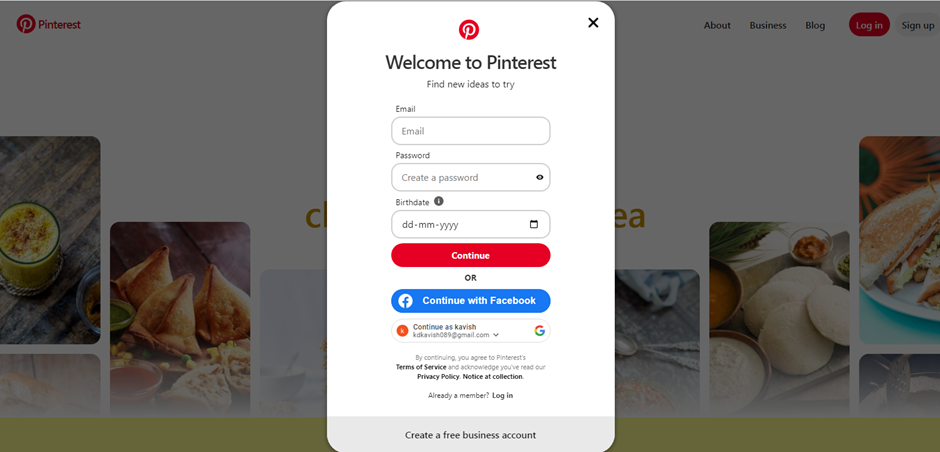
Source: Pinterest
You can see a small window pop up in the middle of your screen asking for your email address, password, and birth date. That window is what we call a modal.
They are essentially pop-up windows that appear on top of the current webpage.
Businesses use them to display important information or prompt users to take action without leaving the current page.
For example, let’s say you’re shopping online, and you add an item to your cart. Instead of taking you to a new page to view your cart, a modal can appear with a summary of your order and options to continue shopping or checkout right then and there.
Nordstrom has made pretty good use of it. (Check the image below)
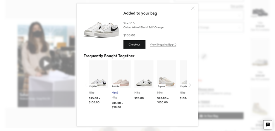
Source: Nordstrom
Modals can also be used for notifications, like when you receive a new message on a social media platform or when there’s an error on a form you’re filling out.
So next time you see one of those little pop-up windows on your screen, you’ll know exactly what it is.
There is no perfect or ideal modal definition in web design. You can only understand it by actually seeing and experiencing it.
But you may be wondering how those seemingly insignificant boxes can make a significant impact on your design.
This is where we jump to the next section and understand the underlying benefits of implementing modal web design in our design structure.
Why should you implement modal web design?
Enhanced User Experience
Upon research, I found that modal design does a great job of enhancing the user experience.
Not only does it make the navigation process simple for you, but it also provides you with the information you need without having to leave the page you are on.
Target was the best illustration of this for all the eCommerce sites I visited.
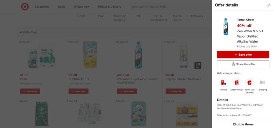
Source: Target
When I clicked on the product Zen Water 9.5 pH Vapor Distilled Alkaline Water, rather than taking me to a new page, a modal window appeared on the extreme right, as you can see from the picture.
This made my navigation simpler and gave me a better experience since I could view a product and its details without leaving the main page, reducing the time taken and having an effective search option.
That’s not it.
By displaying the content in a window, Target was able to successfully declutter the main page, including many more products, and make it easy for me to focus on what’s more important.
And further to that, when I don’t surf through multiple pages, I can access the information quickly and efficiently. This reduces the server requests sent and improves the website speed and performance, which gives a great search experience.
Streamlined Information Presentation
When you design a website, you must prioritize the most important information and make it easily accessible to users. This is what modal helps with.
You can organize content in a hierarchical structure, with the most important information displayed prominently and supplementary details relegated to secondary layers. This ensures that users can easily access important and required information without being overwhelmed by extraneous elements.
Let’s take Door Dash, for example. It is a food delivery app spanning a geography of over 300 cities. I went to their McDonald’s page.

If you observe the image, you can see that they have put all the important information on the main page like
- Status
- Open and close timings
- Ratings
- Featured Items
- Reviews
- Menu
This gives you all the important information you want to see.
But here, they implemented a modal design to showcase information related to a food item on a modal window so that it doesn’t take up the space on the main page, and there is a streamlined information flow to the audience. I wanted to order their Big Mac Meal.
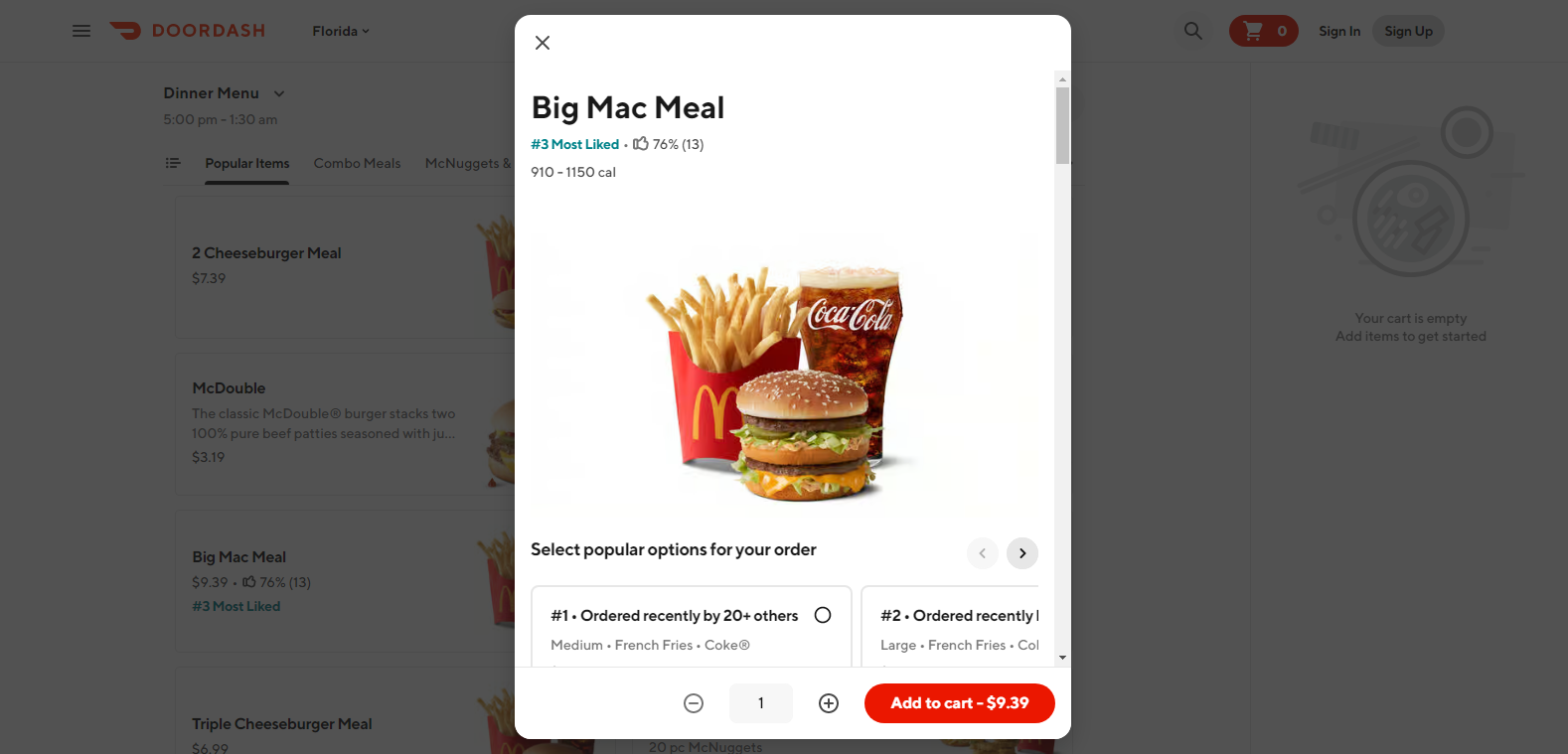
Source: DoorDash
A modal box appeared, which included a secondary layer of information, i.e., related to the food I wanted to order like how many people liked it, a short description, how many ordered it, and having different sections like sizes and other choices.
By doing this, I not only got access to the entire information for their McDonald’s page but also information related to specific food items on the same page, but just relegated to a modal box. Also, the Target example we discussed above is another great fit here.
Increased Conversion Rates
I’m sure the majority of you would think, “How?”.
It was in 2017 before I started with my website design, that I had taken up a one-time project with a guy from Texas. He came to me through a mutual contact (currently my client).
I took up the project to build an eCommerce store for him for his clothing brand. We specifically brainstormed on using modal boxes to offer discounts in various situations:
- Sign up for newsletter – 10% discount on first purchase
- Cross-selling – Adding related or complementary products and getting a discount between 15% and 18%.
- Joining a subscription plan – A yearly plan where the members would get 15% off on all purchases throughout the year for a minimum billing of $29.
It took us almost 2 weeks to decide upon the structure and if we even wanted to go with it. But we somehow got the process going.
End result?
We had 1500+ subscribers to our newsletter in the first 2 months alone after the launch. The average order value received was $102.37 (this included cross-selling, and the majority of the shoppers were women; they bought jewelry to match their clothing choices, and this played to our strengths), $4.4 more than the average order value in the fashion industry in 2020/21.
While we did learn the hard way that our subscription plan was nothing short of a flat failure, and we decided to close it permanently.
But coming to the point, it was not just because the eCommerce store was beautifully built or the product was awesome (yes, they form the major portion of the reason people bought his products), but also, the modal windows were used to communicate the benefits we were providing to the customers.
The cross-selling modal strategy was a sure-shot success, and it helped generate 20% revenue more than what would have been otherwise.
So, modal windows, when used efficiently, with proper branding messages, and relevant and user intent-focused content can boost the online selling process for you and keep your site looking uncluttered and neat with a personalized touch.
(It would be a win-win situation for me to share his website details here, but he had sold it to a bigger eCommerce clothing chain in 2022, and since then, they have revamped it)
If you’re aware of modeless elements, you know how they differ from a modal in terms of usage, objective, and design. But, if you’re new to these terms, I’ll also be explaining the difference between the two.
Modal vs. Modeless: Don’t be confused
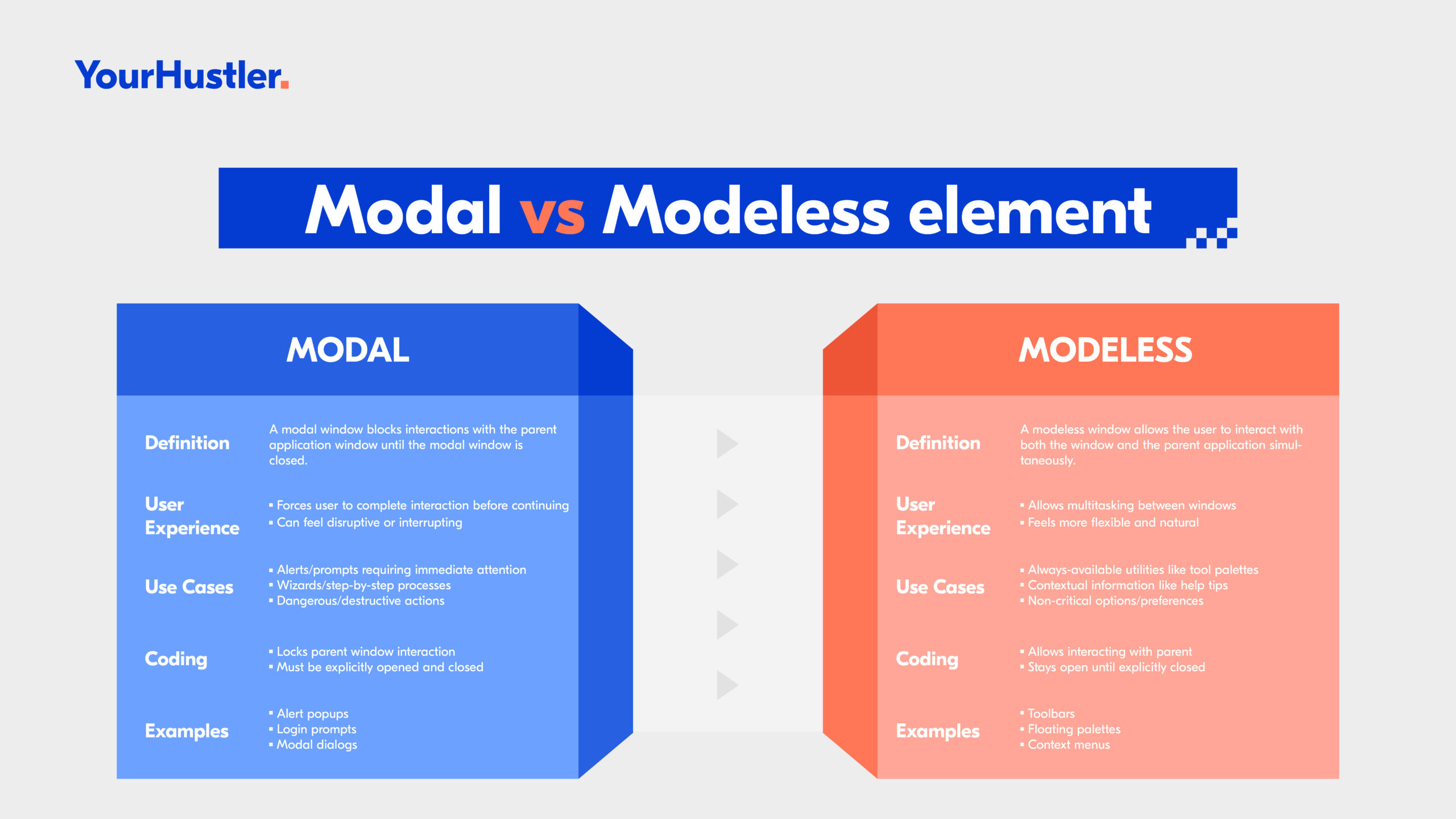
They refer to how information is presented to users on a website.
As discussed previously, a modal is a kind of window that appears on top of the main content and requires you to interact with it before you can continue using the website.
It’s like a pop-up that demands your attention. For example, when you click on a button that says “Sign Up,” a modal window may appear asking you to enter your details before proceeding further.
However, a modeless element, on the other hand, does not require any interaction from you and can be dismissed easily. It’s like an overlay that doesn’t interrupt your browsing experiences, such as a side panel, drop-down list, or pop-up element that will not disturb your navigational flow on the site.
Example:
Here is a representation of the Coca-Cola website.

As soon as I enter the site, I’m immediately presented with a cookie modal, wherein I’m asked to choose between the two choices. Unless I choose any one of them, I wasn’t able to proceed ahead with the site.
This is the perfect representation of a modal window, and many times, it doesn’t go down well with users (not with me too).
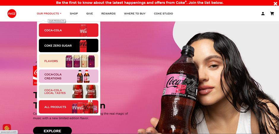
However, once we enter it, you can see the “OUR PRODUCTS” section, and if you check the image above, you’ll see a drop-down list showcasing the different products. I was not only able to scroll through the entire page till the end, but simultaneously, I was also able to see the product lines. This is what a modeless element represents.
Modal and modeless elements are two different ways of presenting information on a website. While Modal windows demand attention and require interaction from users, modeless elements provide additional information without interrupting their browsing experience.
When/How should you use modals?
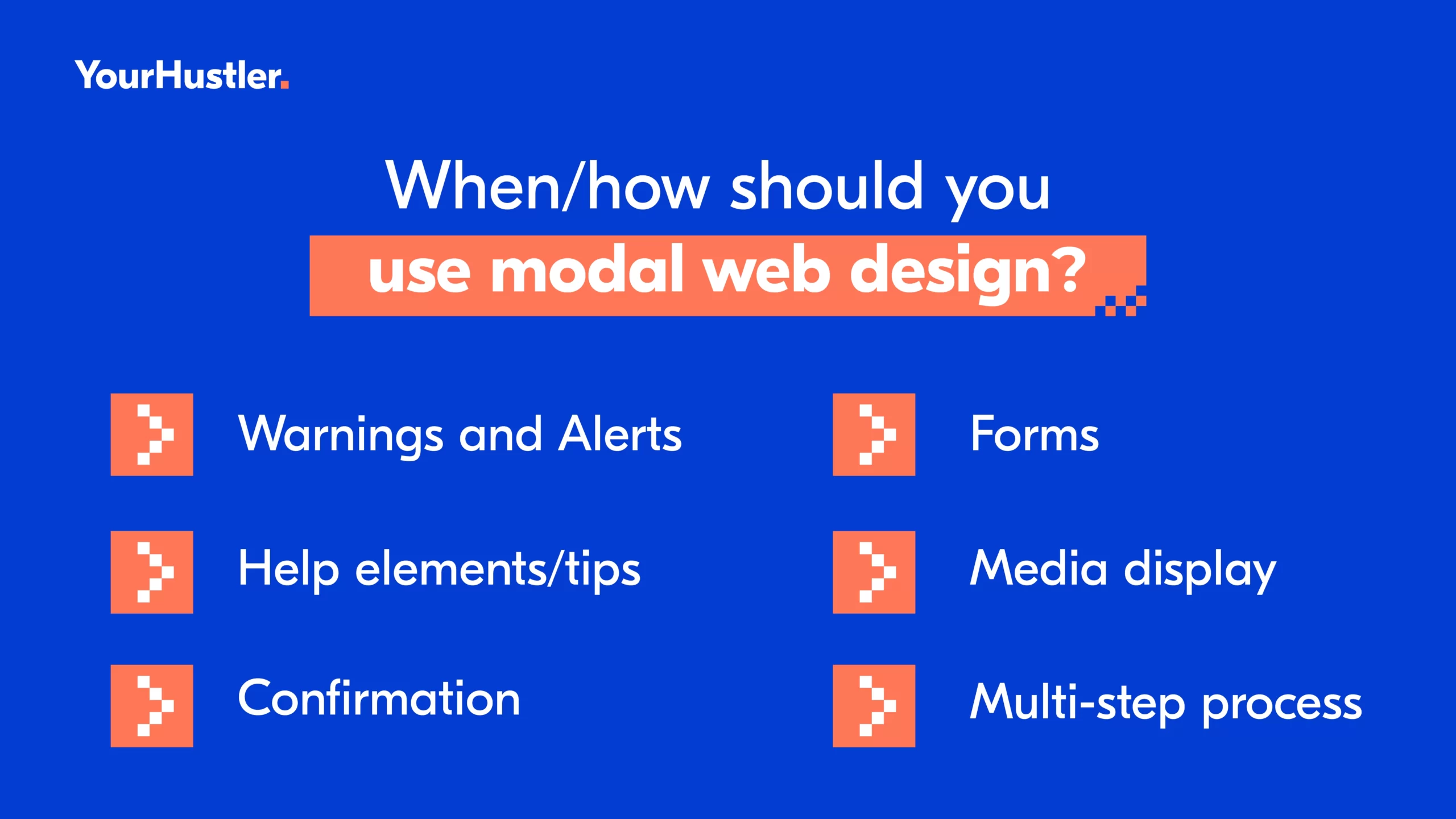
Warnings
We have seen them frequently while we surf through websites.
Warnings can be used to alert users of potential consequences or risks associated with a certain action.
For example, if you were to delete an important file, a warning modal would pop up asking you to confirm your decision before proceeding.
For a better visual understanding, let’s look at ChatGPT, an AI technology touted to bring revolution with its GPT-4 capabilities. Look at the images shown below.

If you click on your profile icon, which is at the extreme bottom left, you’ll find the settings option and you’ll see something like what’s shown in the image above when you click on it. There’s an option “Delete account”. Upon clicking, you’ll see something like the one shown below.

The second image is a perfect depiction of a modal box used to give users a warning about a particular action (in this case, deleting the account).
Using warnings in modals can help prevent accidental actions and improve the overall user experience.
Just make sure to keep them clear and concise, and avoid using too many warnings that may annoy the user. Remember, the concept of modal web design is to enhance the user experience, not detract from it.
Alerts
Alerts are notifications that inform the user about a specific event or action that has taken place on the website. For example, if you submit a form with errors, an alert is triggered to inform you of the mistakes you need to correct.
Alerts can be designed in various ways, such as using colors, icons, and text to convey the message clearly and effectively. It’s important to ensure that alerts are not intrusive and do not disrupt the user’s experience on the website. Modals can be a great way to display alerts as they provide a clear separation between the alert and the rest of the content on the page.
Check this out. I was going through Discord, and I wanted to verify my email.
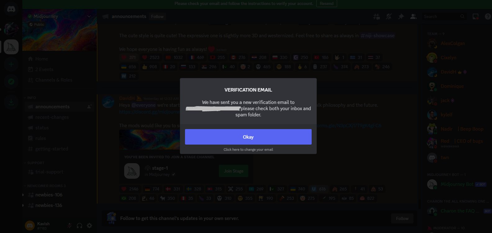
Just as I click on the “Resend” button, I get this modal window, an ideal use case for this section. It alerted me that a verification mail has been sent to my ID.
So, using modals for alerts can help improve user experience by providing clear and concise notifications that require immediate attention.
You only need to understand how to use them sparingly and thoughtfully.
Confirmation
Confirmations are important because they prevent errors and misunderstandings.
They give you a chance to review your choices before finalizing them.
For example, when I recently booked a flight online, a modal appeared confirming my booking details and giving me the option to make any changes before finalizing my purchase.
Here are some other examples which I found suitable.
Source: Dribbble
Source: Dribbble
If you carefully consider the example I shared for Warning, it’s a confirmation modal too.
These modal ideas will make you more confident in the decision you go with and make sure you don’t make any mistakes.
Forms
In my experience, modals work best for shorter forms that require immediate attention or action from the user.
For example, a modal could be used for a sign-up or login form or a quick survey.
You will often see them as an alternative to those stand-alone sign-up or login pages that had no purpose and also disrupted the user flow.
Just check how smartly Louis Vuitton has made use of this below.
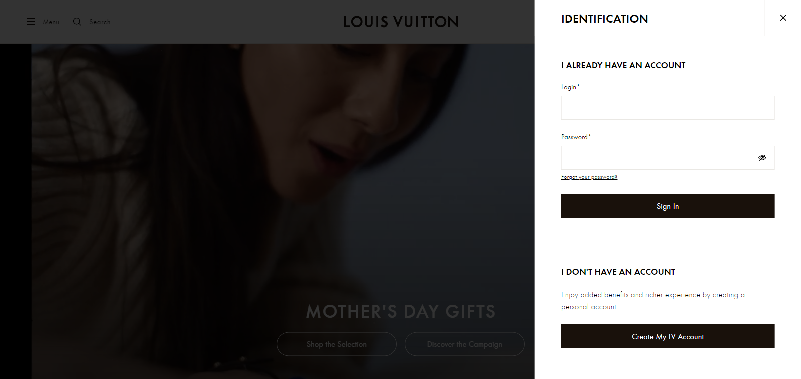
If you were to go to their homepage and click on MyLV on the top right, the above image is what you will see. It does not break the navigational flow of the user.
However, for longer forms that require more input from the user, it’s best to avoid using a modal and instead display the form on a separate page.
This is because these forms are made for a purpose and require the user’s complete attention, so breaking that flow becomes somewhat important here. This allows the user to focus solely on filling out the form without any distractions or interruptions.
Remember, the goal is to make the user experience as smooth and efficient as possible.
Media Display
Media display refers to showcasing various forms of content, like images, videos, or text, for public consumption.
Modal has applications on this end as well.
For example, let’s say you have a product page, and you want to show a 360-degree view of the product.
Instead of linking to a separate page or opening a new tab, you can use a modal to display the image right on the same page. By now, a host of you might already be relating to this. Yes, Amazon is the ideal example of this process.

Source: Amazon
In the image shown above, if you were to click on any of the images, videos, or even the 360 view option, you would see something like this:
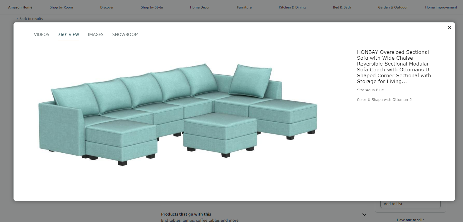
Not only can you see the 360-degree view, but you can also check out the Images and Videos for a better understanding.
The modal window not only displays the image but also lets you experience a complete 360-view of the product.
All these keep the user engaged and reduce the risk of them getting distracted or losing interest.
Multi-step Process
This is where things get a little interesting.
Now, imagine you were to complete multiple steps to have your account created. A few scenarios here:
- You are redirected to another page, where you complete all the steps, taking a good amount of time.
- You remain on the main page, and you’re presented with one modal for each step.
- You remain on the main page, and you’re presented with a single modal that includes all the steps in it.
There are differences based on perspective.
However, research shows that the first 2 points tend to have a slightly adverse impact on user attention and experience.
When you redirect the user to another page simply to create an account, you’re unnecessarily burdening them. And also, you’re breaking their flow for navigation.
Next, when you present them with a modal for each step, you make the page more cluttered with multiple modals. This creates a bad experience and makes it cumbersome for the user to create an account, let aside browsing your site.
Both these scenarios break the user browsing flow and impact their journey.
However, with the third point, where you present all the steps in a single modal, you are enhancing user interactivity and even showcasing more seamless navigation without breaking the flow.
Pinterest is the best example of this.
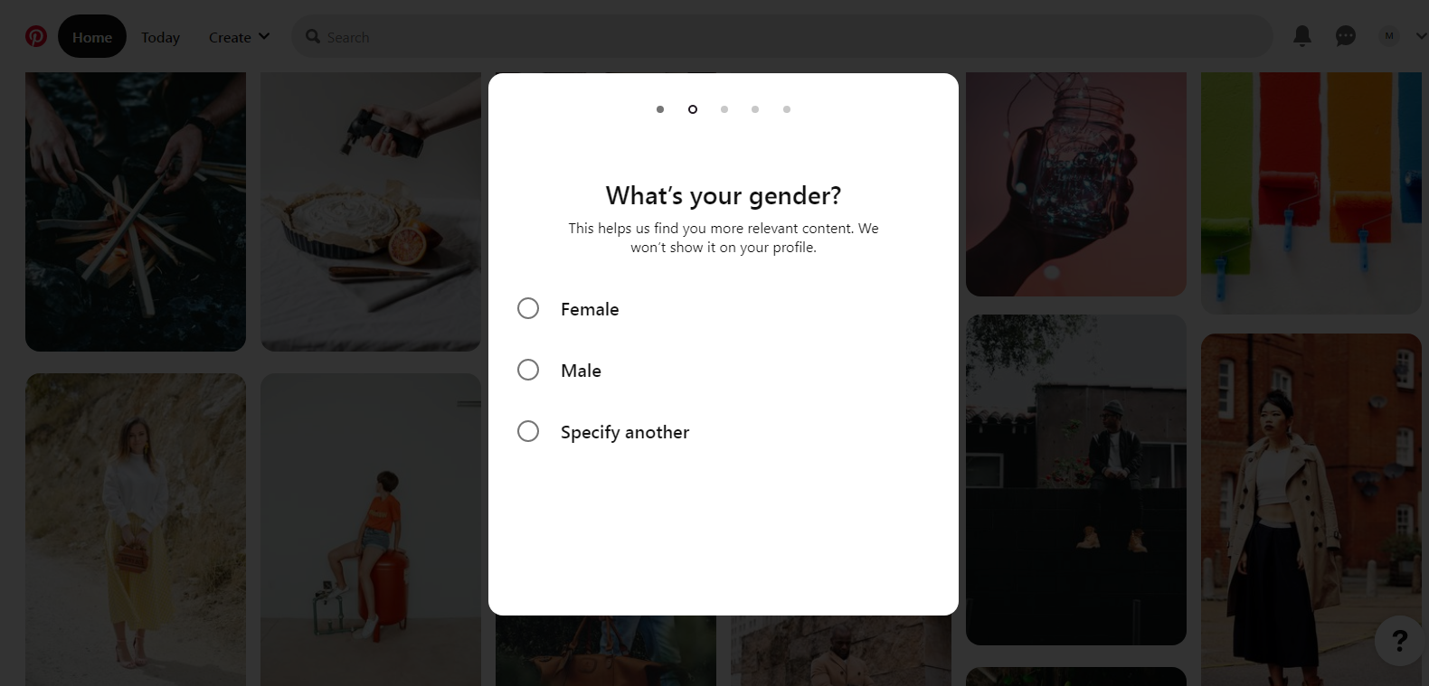
Not only do you fill out the form swiftly and continue browsing, but you also form a positive view of this process and hence the website.
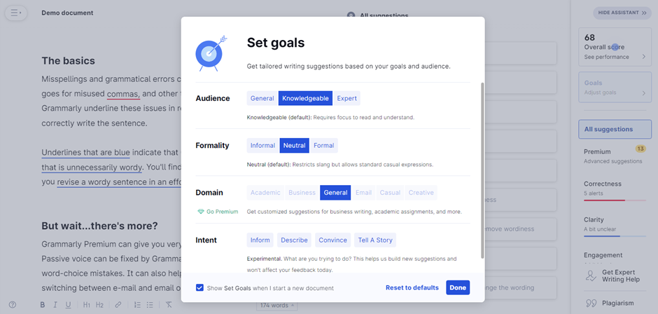
Help Elements/Tips
You must have seen those welcome, tip, and help boxes that occur while you’re using a new application. Those are modal boxes.
For me, Grammarly is an ideal use case for this.
When you sign-up and are redirected to the app page, the below image is what you will see initially. It’s an example of a welcome modal.
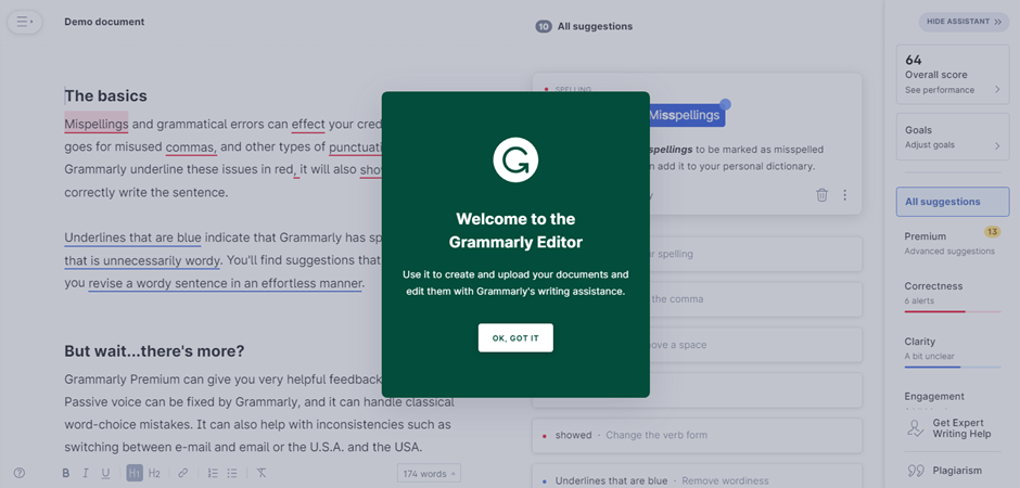
Then, just as you follow the small “blue circles” on a text or an option that Grammarly hints to click on, you’ll see the below 2 images as well, which work as a help element or tip.
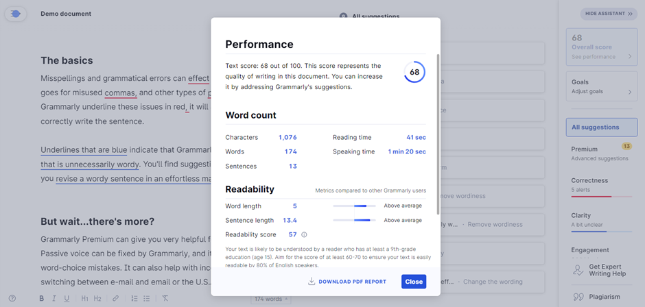
The welcome box appears only for first-time users. Thereafter, you can only experience the help and tip boxes.
Coming to the point, these were, again, another cool way to present information to the users in the form of help or tips without redirecting them to a new page or taking space on the app page they’re on.
Now, after seeing the applications and examples, I hope it was crystal clear to you what modal web design includes, its benefits, and where it should be applied.
But, it’s also important to consider the best practices one must keep in mind when implementing modal web design (basically the do’s and don’ts). Let’s look at some important points given below.
(Note: We are not through with examples just yet. You’ll find a dedicated section for examples after the below section)
Use modals intentionally and infrequently
Modals are great for drawing attention to important information or actions, but they can also be disruptive and annoying if overused.
As a user, I’ve been frustrated by a couple of news and eCommerce platform sites that bombard me with pop-ups and modals every time I visit.
It’s like being interrupted in the middle of a conversation – it’s jarring and makes me want to leave.
That’s why you must use modals sparingly and only when necessary.
For example, if you have a form that requires user input, a modal window can be a helpful way to focus their attention on the task at hand. Or if you have an important message that users need to see before proceeding, a modal can be an effective way to communicate it.
But before you add a modal to your website, ask yourself:
- Is this necessary?
- Could this information be presented in a less intrusive way?
If the answer is yes, then consider alternative options (modeless elements, for example).
Use modal boxes thoughtfully and with purpose. Don’t overwhelm your users with unnecessary interruptions – instead, focus on providing a seamless and enjoyable experience.
Deactivate all background elements
When a modal pops up, all background elements should be dimmed out.
This ensures that the user’s attention is only on the modal window.
Distraction and confusion are common reasons for modals not being able to fulfill their purpose.
If other elements on the screen are still active or clickable, it can be easy for the user to accidentally click on something they didn’t mean to or get lost in a sea of information.
Starry is a good example to explain this point further visually.
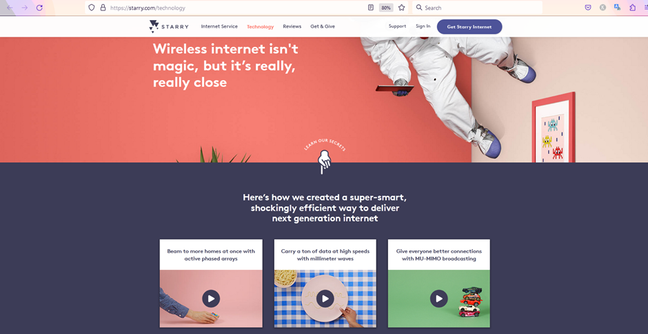
When you go to the technology section. The above image is what you’ll see initially.
If you click on the video related to millimeter waves, the image below is what you’ll come down to.
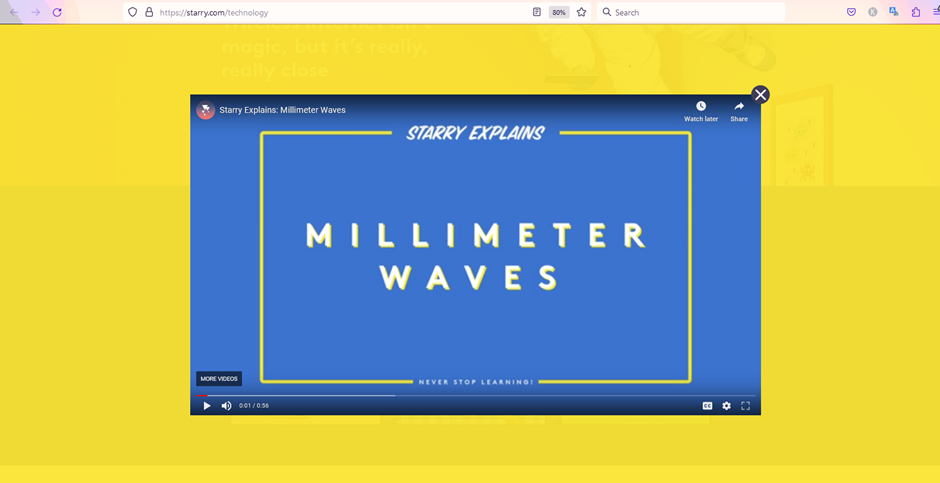
It’s the perfect example of a modal box, disabling background elements and even dimming them out.
So, make sure to keep your users focused on the modal. They should not have any reason to be distracted or confused.
Write clear instructions and button text
The point is self-explanatory.
But for those who aren’t well-versed with modal, the modal box which appears on the user’s screen should have very clear instructions, such as what is the intention or objective behind their appearance.
And further, they should have a text-filled button. For example, a sign-up modal form should have a button at the end with the text “Sign up” or “Sign me up” on it. This will make sure the user understands what the button denotes and why they should click on it.
You would not want to design a button with the text “Login” when the purpose of it is to “Sign up”. Avoid such mistakes as well.
The more seamless you make the experience for the user, the better will be their overall journey on your site.
Source: Dribbble
The image above shows how a modal is created with a very clear purpose or objective. Even the button has a clear signal, which is to sign in to the user.
This is what you must follow as well. Your modal web design elements should have a sense of purpose and be clear to understand.
Give users an out
Users on your site should not feel compelled or forced to interact with the modal window.
Provide them with the option to opt out of it if they aren’t interested.
This could include a “Close” text or an “X” symbol at the top right or left corner of the modal box.
For a more advanced solution, you can also try and implement a “cancel” button which could be an alternative to “next” or “continue”. And further, you can also opt to let the user out of the modal window if they click anywhere outside of it.

The above modal window shows details related to the word count of a blog (Well, it’s for this blog that you’re reading).
If you check carefully, it has both an “X” symbol and the “Cancel” button (serving as an alternative to “OK”).
This ensures I am not entitled to go through the modal window, and I can opt out of it whenever I want to.
I like such an experience where I’m not forced to do something.
This is what you should keep in mind when building a modal window.
Size your modal window appropriately
This is somewhat important in specific situations.
For instance, imagine you have an explainer website.
You create videos on how to make beverages or food from popular restaurant chains.
Basically, a DIY method.
You have created a video on “How to make a better Iced Caramel Macchiato than Starbucks,” and you want the user’s undivided attention when they watch it.
In such cases, a modal window is an ideal use case.
Sizing the modal window large enough to cover 90% of the website screen and fade away the little background portions is a good option to consider.
For a first-hand experience, below is the image of the WordPress site of one of my clients.
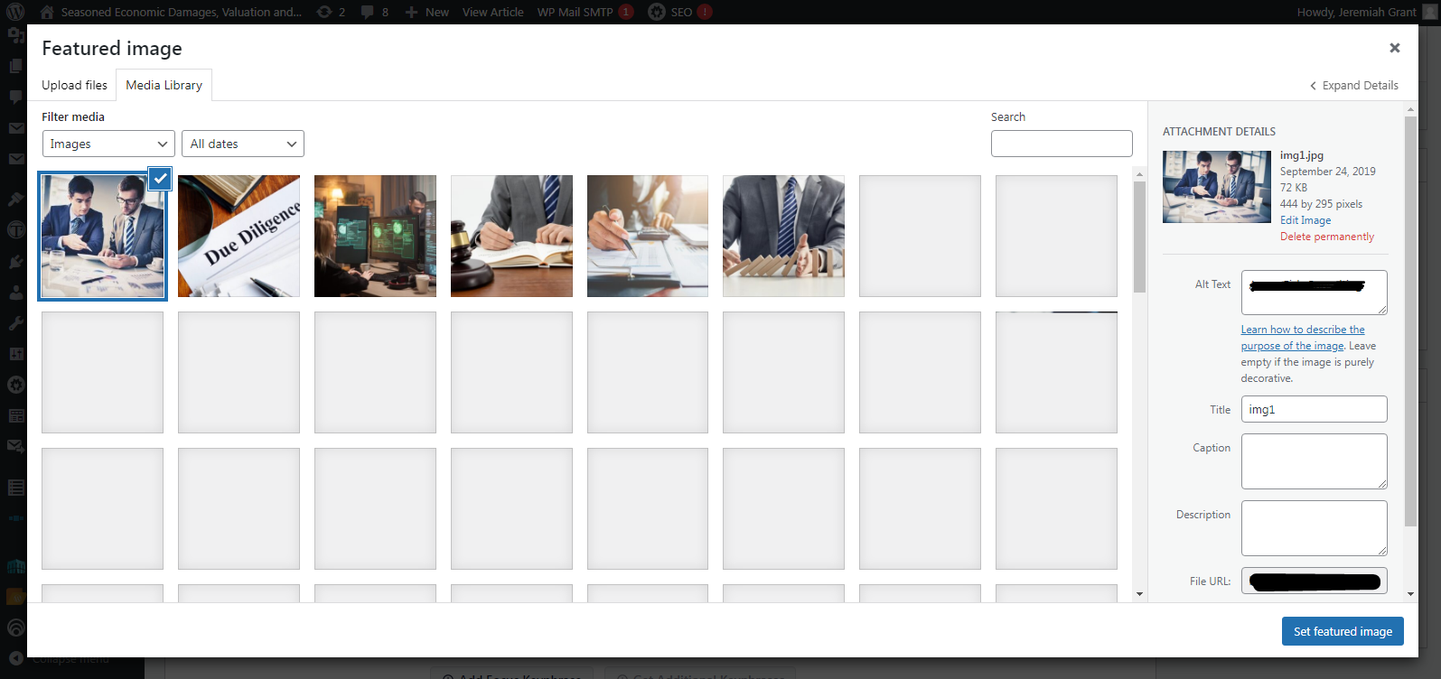
I wanted to change the feature image of one of the blogs. Just as I click on the appropriate option, this modal window appears. It covers more than 90% of the page and fades the remaining background portion. This is exactly what’s needed.
Rather than giving me a reason to get distracted, WordPress ensures I am focused on changing the blog image. When you implement the same, the user tends to focus on the task modal that is intended for.
Limit modals on mobile
Modal windows can be useful for displaying important information or prompting users to take action.
However, on mobile devices, they can be particularly frustrating for users because they take up a lot of screen real estate and can be difficult to dismiss.
To illustrate this point, imagine you’re browsing a website on your phone, and a modal window suddenly appears, blocking the content you were trying to read. You try to dismiss it by tapping the X button in the corner, but your finger slips and you accidentally tap the button inside the modal window instead. Now you’re taken to a completely different page and have to navigate back to where you were before.
Frustrating, right?
That’s why I recommend limiting modal usage on mobile devices as much as possible.
Instead, consider using other design patterns like slide-in panels or bottom sheets that don’t take up as much space and are easier to dismiss.
Your users will thank you for it!
Some noteworthy examples
This section is specifically for those who want to see a few more examples regarding modal web design.
No more content, only images. Enjoy them.
Also, feel free to contact us at contact@yourhustler.com if you have any modal web design ideas in mind that you would like to share. We can also help you with your website should you require it. But for now, enjoy the examples.
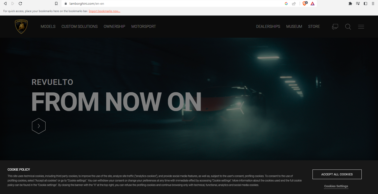
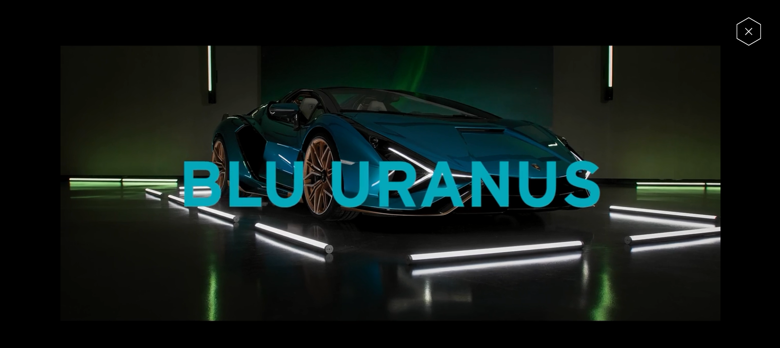
1. Lamborghini (Cookie Policy Modal and Media Display)
2. Rolex (Search box modal)

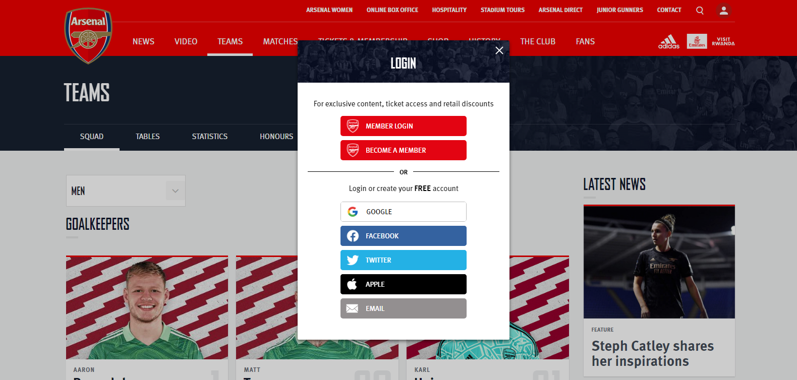
3. Arsenal FC (Login modal)
4. Walmart (User items modal)

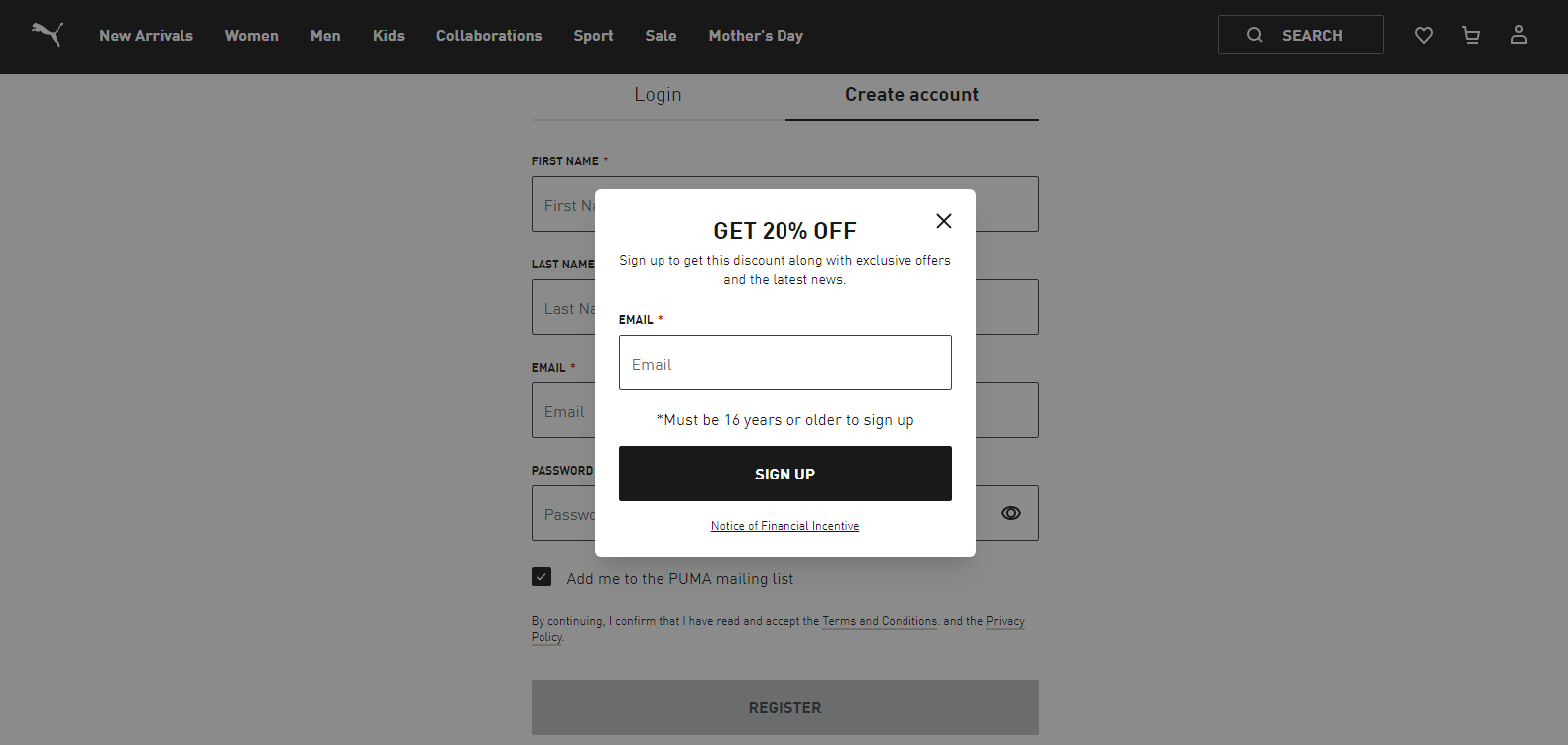
5. Puma (Discount Modal)
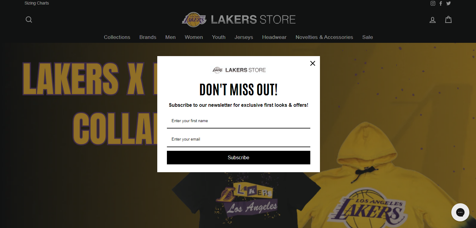
6. Lakers (Newsletter Subscription)
To sum things up
As I conclude this blog, I can confidently say modal web design is not just a passing fad. It’s the future of user experience.
Providing users with a seamless and interactive experience is crucial in today’s digital world, and it does just that.
Through working with clients, I have seen the positive impact of modal design on user engagement and conversion rates.
The use of modals for calls-to-action, forms, and notifications has proven to be effective in capturing user attention and driving them towards desired actions.
However, it is important to note that modal design should be used strategically and not overused. Too many modals can lead to a negative user experience and result in high bounce rates.
And if you’re looking for a professional and intriguing web design service, look no further than Your Hustler. Our design and development team can help you create a seamless and engaging user experience through different design approaches. Don’t miss out on the opportunity to take your website to the next level.
We’ll provide you with a free no-obligation consultation to ensure when we talk, it’s about ideas, scope, and the extent to which we can help you through our website design approaches and processes.


